2025
Albert Plus
A redesigned companion for NYU’s Albert — integrating course search, bulletin information, and timetable planning into one connected flow so students can make registration decisions faster and with less stress.
TIMELINE
Sep 2025 - Dec 2025
TEAM
Case study w/ Charles Zhang
Tech@NYU Dev Team
ROLE
Designer & Frontend Developer
SKILLS
Figma, Typescript, Next.js, Convex
How can NYU students search courses and plan their degree more efficiently?
Target Audience: NYU Students.
PROBLEMS
The current Albert system has four key pain points that consistently frustrate students during registration.
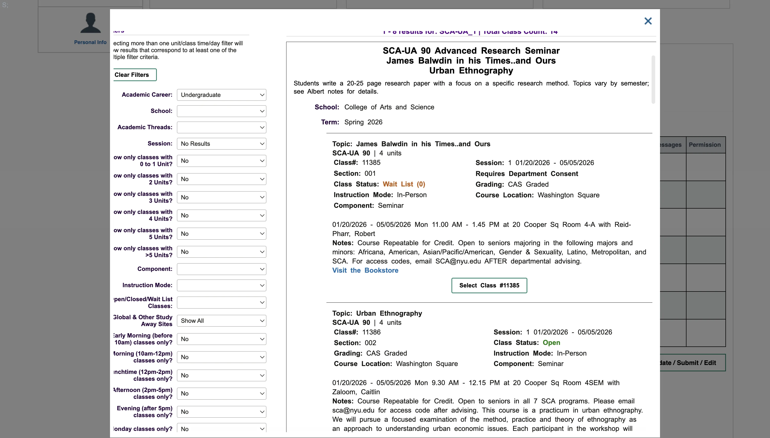
Messy UI/UX
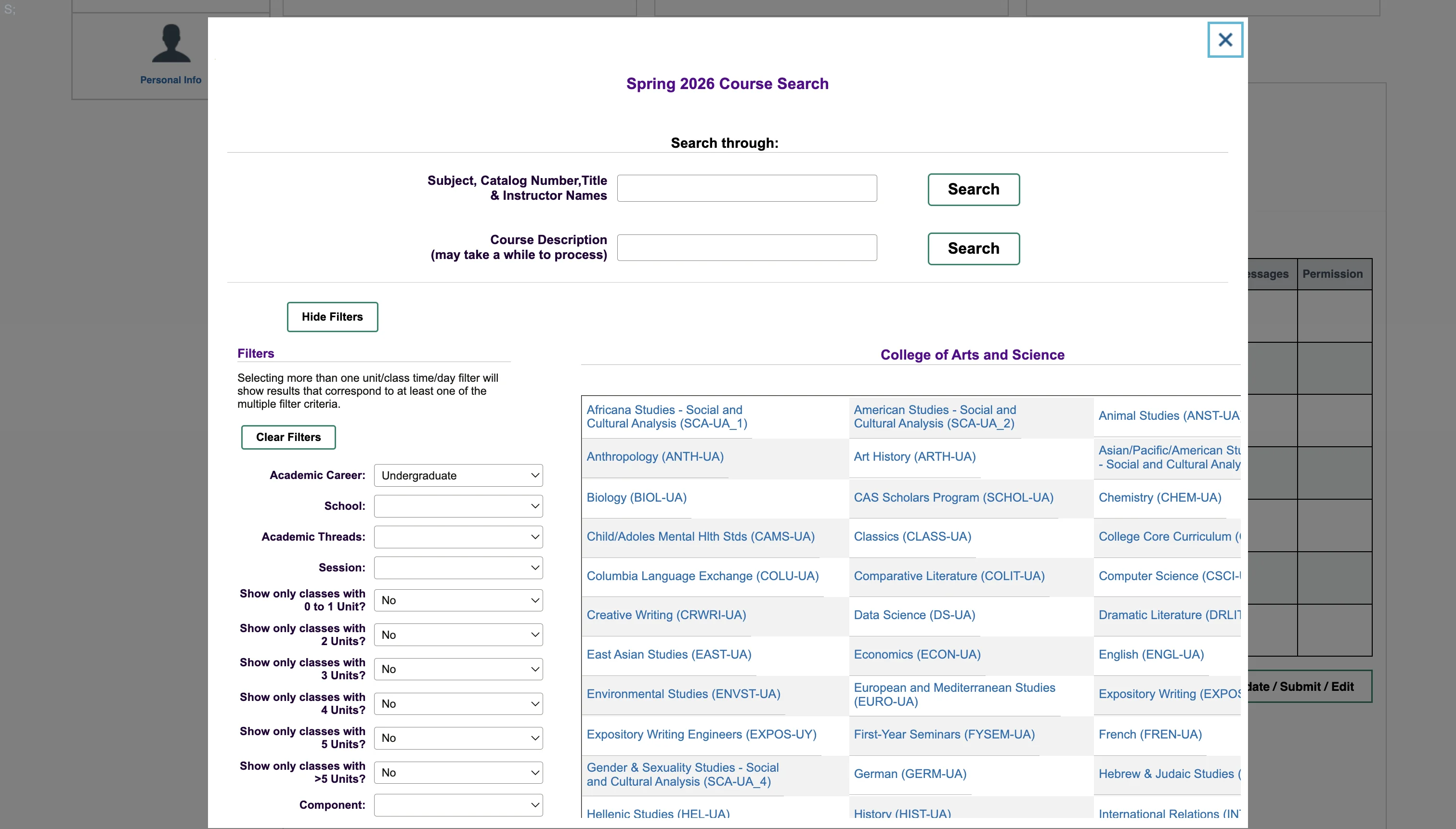
Cluttered and outdated — too many clicks, dense text with no visual hierarchy, and pop-up modals that hinder scanning.
Hard to Search & Find Courses
15+ filter dropdowns return plain text lists with no way to compare sections, professors, or timings side by side.
No Course Planning Support
No built-in way to track degree requirements or see what courses still need to be completed.
Can’t Preview Calendar
No calendar preview before committing — students can’t spot conflicts or build a balanced schedule without registering first.
SOLUTION
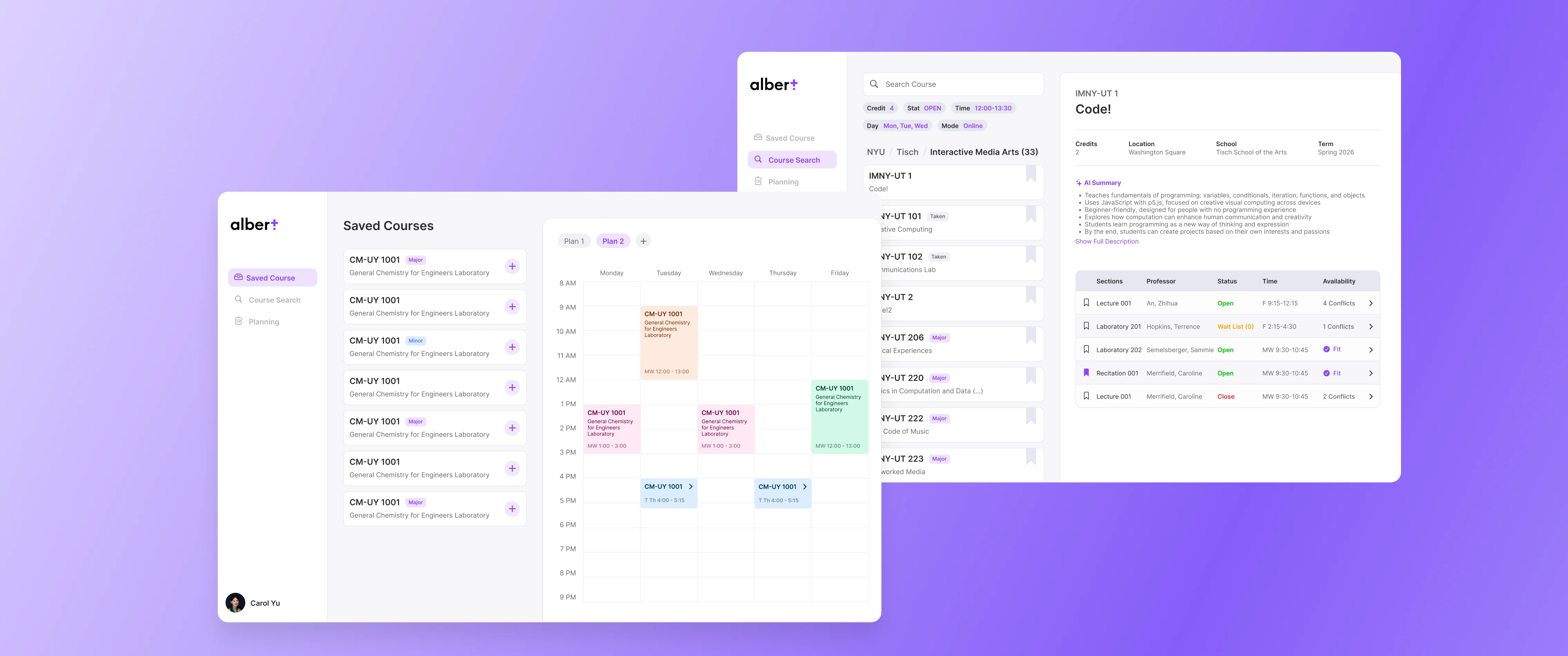
Smart Course Search
Easy to find courses by navigating easily through school and major. Have filters and search bar to help you find the course you want.
AI-powered course detail & Save courses
Clearly sees all course info and get AI summary of the course. Save courses to your account and access them anytime.
Time Table Builder
Build your own time table by adding courses and see how it looks like. You can save multiple time tables and compare different course plans.
4 Year Plan Builder
Build your own 4 year plan by adding courses and see how it looks like. You can also see the bulletin requirements of your major and minors and see if you are on track to graduate.
FIGMA PROTOTYPE
PROCESS
USER RESEARCH
I interviewed 20+ NYU students to understand how they really feel about the course selection system.
I have to click through so many pages just to find one course. The interface feels like it was built in 2005 and never touched since.
There's no good way to compare two sections of the same class. I have to open like five tabs and flip back and forth.
I genuinely don't know if I'm on track to graduate. Albert gives me a checklist but I still have to manually figure it out every semester.
I accidentally enrolled in two classes that overlap because there's no calendar preview. I didn't find out until the first week of class.
Existing Alternative — Einstein
Einstein is a student-built tool offering a cleaner course list and timetable builder, but it still falls short in key ways:
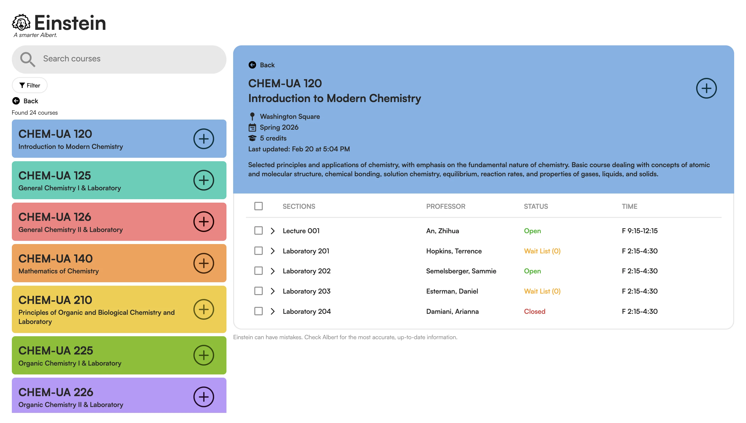
Cleaner Than Albert
More readable course list with less visual noise than the original Albert interface.
All Course Info in One Place
Course details, times, professor, and credits are all visible without navigating away — easy to scan and compare.
Built-in Timetable Builder
Students can preview their weekly schedule before committing — a useful step the original Albert lacks entirely.
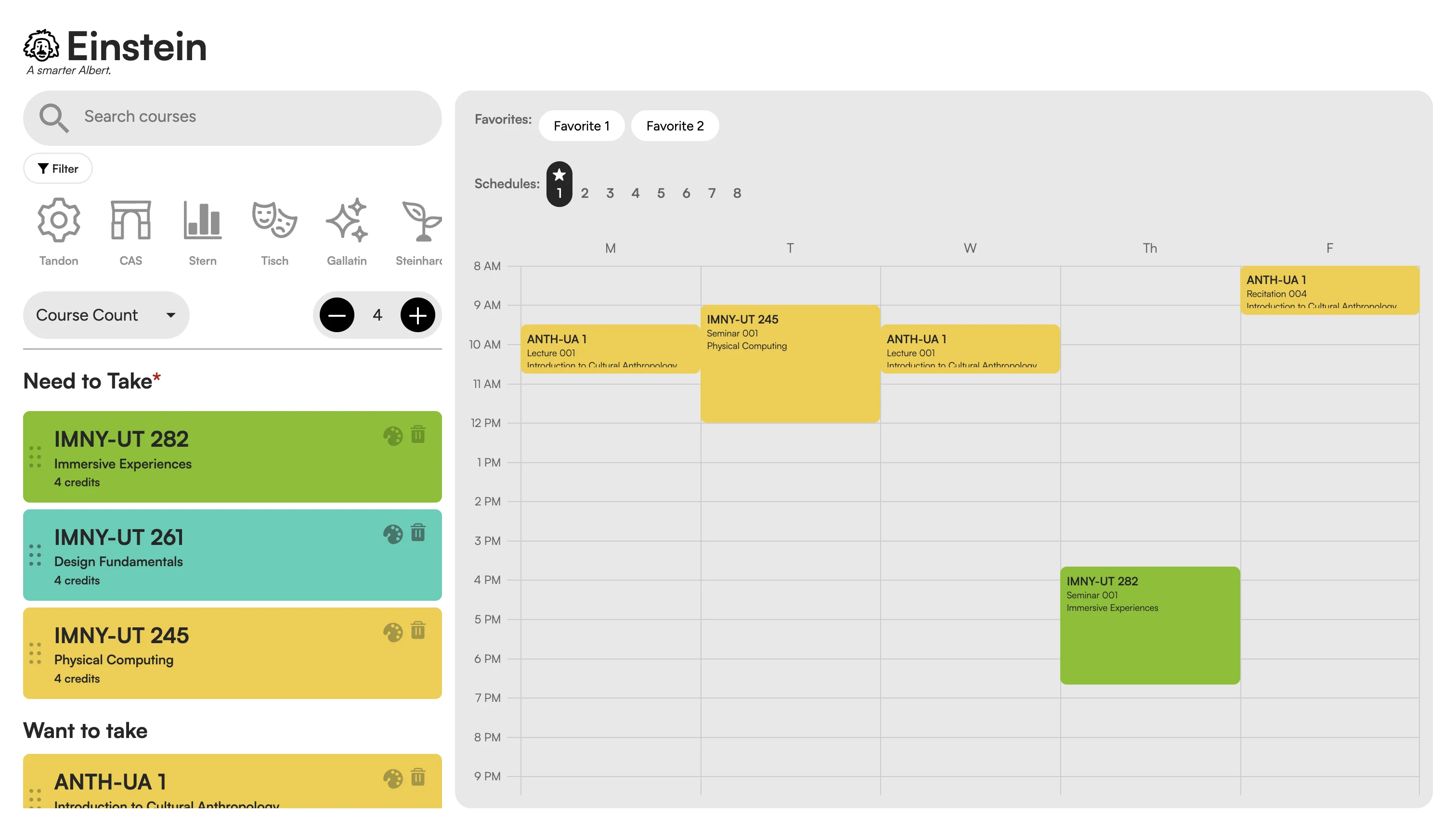
Visually Overwhelming
Bright, saturated course cards with no clear logic create a loud patchwork that makes scanning harder, not easier.
Hard to Navigate
Small, unlabelled school filter icons and no clear hierarchy make it hard to move from search to selecting and adding a course.
Calendar Feature is Hard to Use
No conflict or credit-load feedback. Switching between Favorites and numbered Schedules is unintuitive and easy to lose track of.
Existing Alternative — Paper (Northwestern)
Paper is a course planning tool used at Northwestern that introduces smart multi-year planning and a fluid schedule builder — but its interface works against its own strengths:
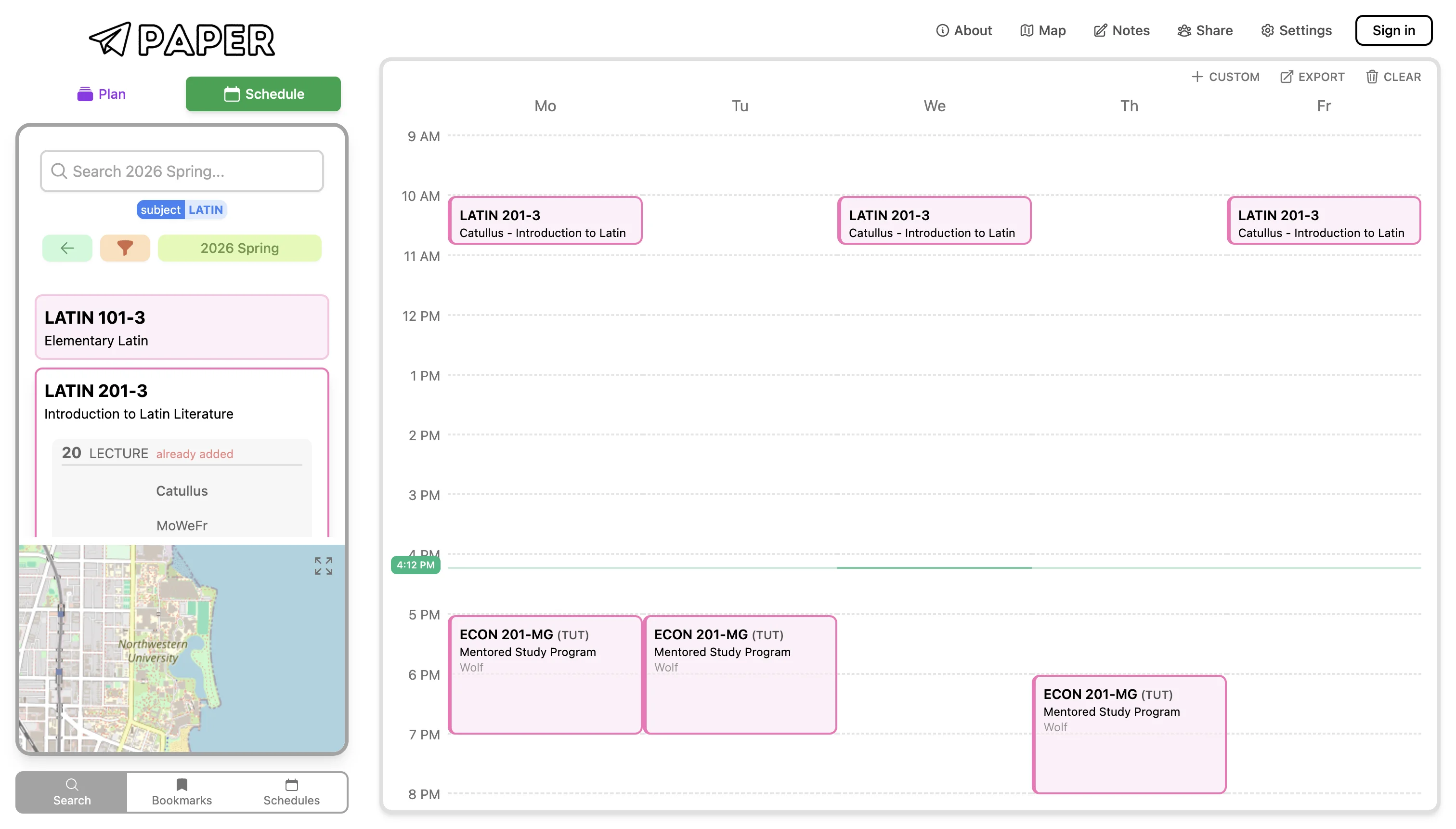
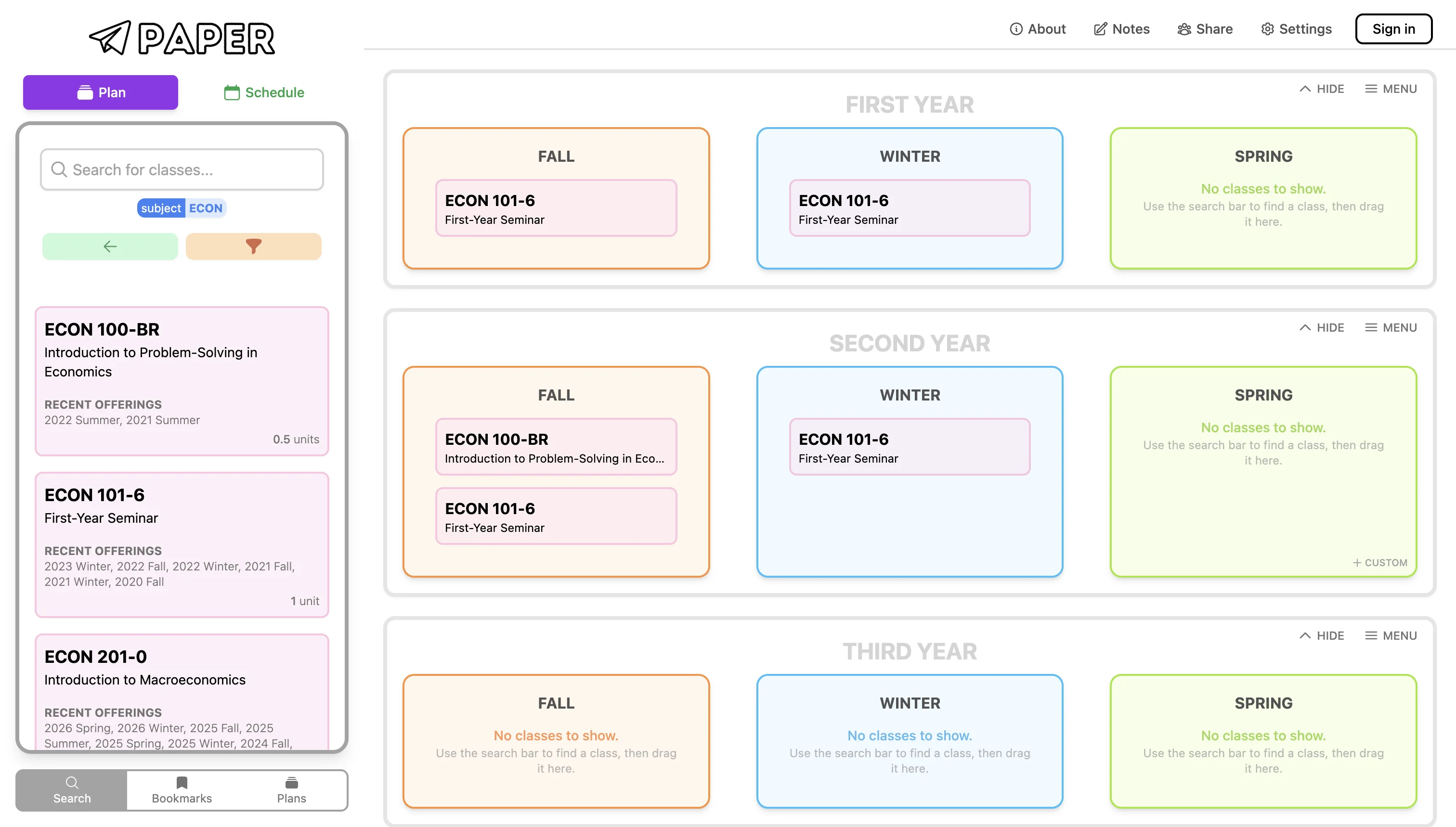
Smart 4-Year Plan
Drag-and-drop courses into a year-by-year grid makes long-term degree planning intuitive and visual — a feature missing from most course tools.
Course-to-Schedule Flow
Searching a course and adding it directly into a live calendar preview is seamless — students can spot conflicts before committing.
Cluttered, Hard to Read
Dense information and inconsistent visual hierarchy across Plan and Schedule views make it difficult to know where to focus at any given step.
Disconnected Navigation
Switching between the planning grid and the weekly schedule feels like two separate products — no clear through-line guides the user from search to plan to register.
Conclusion: Create a clear and simple tool with easy and smart navigation that helps users search courses easily and plan their degree more efficiently.
From design system foundations to full hi-fi screens — I built Albert Plus iteratively in Figma, establishing components, layout patterns, and visual language before moving into refined interface explorations.
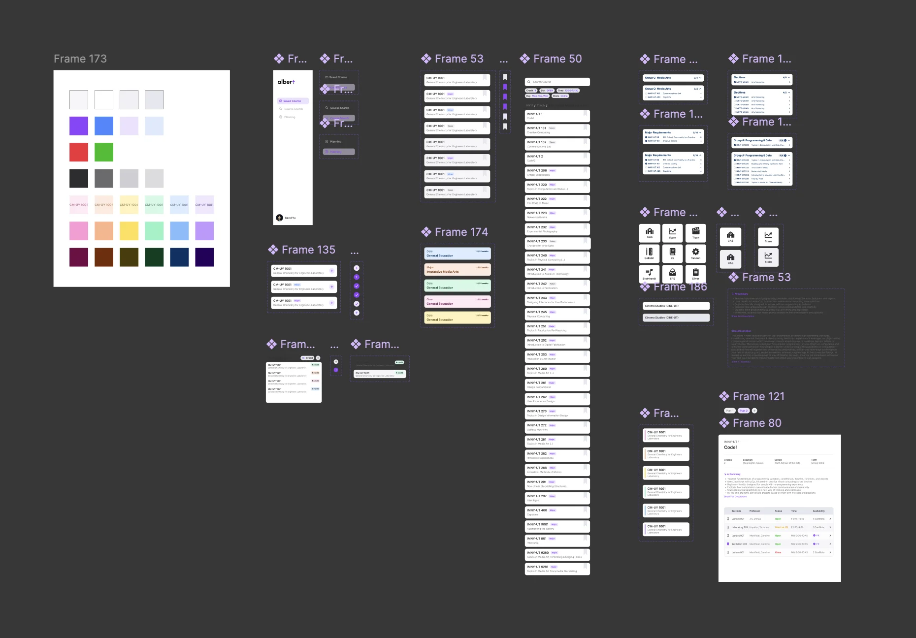
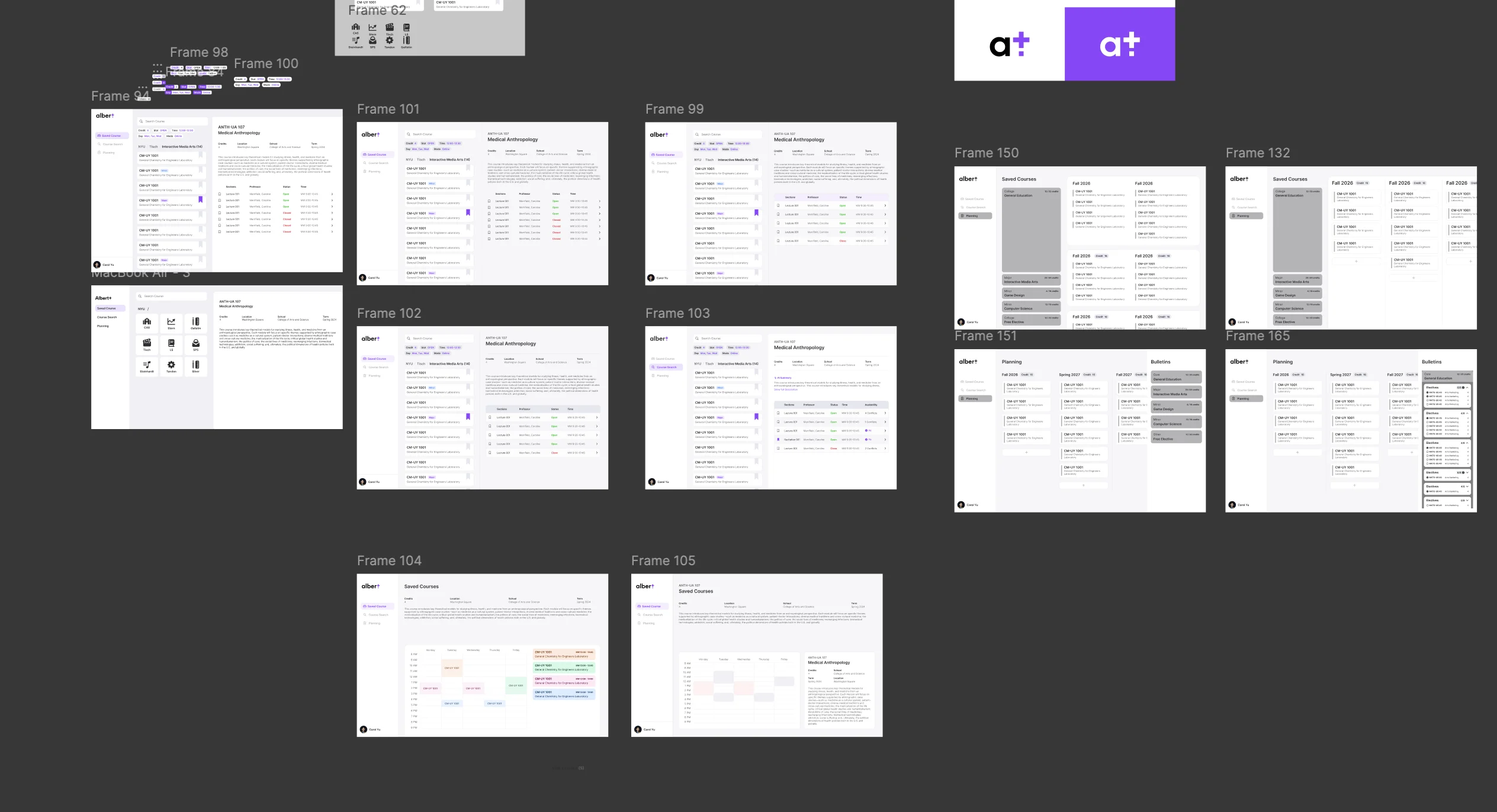
DESIGN DECISIONS
I didn't treat this as a set of separate features — I designed "search → review → schedule" as one continuous, connected flow.
Connecting the Flow
Albert forces students to jump between search, bulletin, and timetable separately. I designed these as one continuous journey — state carries forward instead of resetting.
Pages That Influence Each Other
Selecting a course updates the timetable live. Adjusting a time slot filters the course list back. Users never re-enter information — the interface keeps everything in sync.
See Results, Not Data
Core details surface first; additional context expands on demand. Students see outcomes directly instead of having to process raw data themselves.
Trade-off
More information means better decisions — but also higher cognitive cost. I resolved this with layered disclosure: key details always visible, deeper context revealed on demand.
REFLECTION
This project was a great learning experience for me. I learned a lot about how to create useful tools with complex user experiences, and how design can be used to create much better workflow and experience. Really bringing the concepts into practice.
Two key takeaways from this project:
Fragmented Flows are the Real Problem
Complex systems feel overwhelming not because they lack features, but because their flows are split across too many disconnected surfaces. The challenge here was reassembling those pieces into one natural path.
Design as Flow Reorganisation
The value wasn't adding features — it was reordering the sequence. Search, options, and schedule visible together in sync makes decisions faster and far less stressful.